Sunday, August 30, 2009

Whiff of Joy Guest Designer Call


I made this card for the Whiff of Joy Guest Designer call over at Katharina's blog. I used Melinda blowing kisses for my image.

The dp is English Garden by Making Memories that I purchased at Michael's. I colored Melinda with Copics Caio and Sketch markers. I created a mat using a Nestabilitie and added ribbon.I used the same papers for the inside and added a yellow mat for journaling.

If you are interested in the WOJ Guest Design call here is the info from Katharina's blog.

I am very excited to open another Whiff of Joy Guest Designer Call!! It's been a long time since the last GDT Call, that's why it is such an exciting event for me :)

We are looking for passionate, talented crafters with great colouration skills to complement our Design Team for the next 2,5 months (end september, october, november).

As a guest designer for Whiff of Joy Stamps you'll have to:
  • Create a card or project or scrapbook page with every stamp we'll send you
  • post these on your blog and upload it to the Whiff of Joy gallery
  • participate in every other Design Team activity, such as the Project of the month
  • have your own blog, which is essential to show and promote your works created with our stamps

The chosen guest designer will have the following privileges:

  • You'll get every stamp that is going to be release during the next 2 months
  • You will get a 10% discount on all your orders from Whiff of Joy Stamps for the period of 1 year.

Important information:

  • Everybody can enter from anywhere in the world!!
  • You can submit as many cards as you like, but they have to be new ones.
  • You have to use at least 1 Whiff of Joy Stamp on you card!!!
  • The Guest Designer Call ends on Saturday, September 19th, 8 pm GMT+1

What do you have to do to enter the Whiff of Joy Guest Designer Call?

  • create a card, scrapbook page or papercraft project using at least 1 Whiff of Joy stamp
  • post your creation on your blog (and SCS gallery if you have one) letting people know about our Guest Designer Call
  • add your name and link to your post to the Mr. Linky Widget below

Saturday, August 29, 2009

Today's Special

Another Magnolia --- Chef Edwin.

This card qualifies for the Friday Sketchers using a sketch created by Claudia Rosa.

Edwin is sitting atop some rust/orange colored ribbon and is colored using Copic Caio and Sketch markers. The colors of the card are gold, rust/orange, blue and cream. It is definitely a male card, exactly what I was looking for. Here is a close up of Edwin.

I used the rolling pin as my menu holder and made a sign with the menu choice underneath. I tied them on with brown twine. I added some rubber for added dimension.

The inside of the card uses the same paper and is rather plain -- again, it is a male card so didn't want to put anything frilly so left it as is.

Cooky over you

This card was made using the sketch from the Pink Elephant.

I used Chef Tilda from the fall collection. Another cutie!!

The story behind this card is one that happens to me very often. I had decided to make a card using this Tilda so I went looking for something for her to sit on. I found this peach lace that I have and wanted to use it. Then the search for paper began in my stash to find something that would go with this lace. First, found the dp paper (unsure of brand) and then the other papers. I think it took me about 1 hour to find the perfect papers. I like them together, they look good.

I colored Tilda - here is a close up:
You can also see the lace that is behind her. Isn't it pretty? Then I put her on the mat and it just didn't look right so I decided to try my hand at distressing (gulp). I have some of the Tim Holz ink and hadn't used it yet so drug it out. I took a scrap piece of fabric and started inking. All in all, I think it turned out OK and it gave me the look that I wanted.

The sketch at the Pink Elephant has the sentiment under the main focal point but I decided that I wanted a hanging 'menu' so I moved it to the upper left. The menu is hanging on Tilda's rolling pin.
Any finally the inside:

All in all I think this turned out pretty good. At least I am satisfied with it and I just loved coloring this Tilda!! TFL!

Thank You Friend

This card was made using one of the new stamps from Magnolia, Dinner Tilda. She is part of the Yummy for your Tummy collection that is available over at Diana's shop. She, and all of the others, are just soooo cute!!

This card qualifies for five challenges:There are so many wonderful challenges out there, and I usually can't get to them all, so I like to combine as many as I can. I usually only have the weekends, and some evenings, to create and I love it sooo much that I want to enter them all --- LOL!! Does that make me a challenge junkie???

OK - so on to the showing. I used pastels for my colors. The circle paper is from Nana's Kids collections by DCWV. The other papers are just textured card stock (one of my favs for creating).
I used Prisma and other flowers on the front. I sprayed the large flower with shimmerz. I added a rhinestone to the center of the two smaller flowers. Tilda is seated on polka dotted ribbon and there is also some behind the large flower. The sentiment says "Thanks my friend".

I added some small beads to Tilda for her bracelet and necklace. I also added on to her ear for an earring. She also has a small lime green flower in her hair. Her shoes have Crystal Glaze added to make them look like patent leather. I used a light gray to give her some shadow.
The inside of the card is made after the sketch using the same papers.
The left inside says "Friendship isn't a big thing, it's a million little things" I added more flowers and placed rhinestones in the middle.
The right side has a pink non-textured journal mat with a polka dotted bow and a little rhinestone in the lower corner.

This was a fun sketch and lots of fun colors! TFL!!

Sunday, August 23, 2009

Tilda says BOO!

I made this card for the Magnolia-licious Highlites Blog Hop.

One of the DT, Sharon Caudle, made a 'boo' card using her Cricut and offered the .cut file. Thanks Sharon!!

On to the showing!!


First off, I didn't have any Halloween stamps and really wanted to make this card so I improvised. The Tilda on the front is Tilda propped on her elbows. She normally has pigtails but I cut them off. I made a witches hat to place on her head. I tied purple, black and orange ribbon on the outer 'O'. I cut out a spider and mummy dog from some excess paper. Why do spiders have to have eight SKINNY legs??? LOL!


Here's where I thought I really got ingenious. I had a stamped image from the image chain over at Magnolia-licous Yahoo Group of the easter rabbit. At first, I was just going to make the bunny and Tilda could be a bunny but it really didn't go with the colors that I had picked so I ........


wait .......


wait .........


Made her bunny into a kitty. I colored her in greys and orange and added a tail!!

Didn't she turn out cute?! I placed her in the center of the inside so when the card is closed you can see her face in the center O. You can see her peeking out above, right above Tilda's witch hat. Here is a pic of the inside.
The paper that I chose for the card was white on the backside so when I cut this I flipped the paper over so the white was showing and after it was cut I had a perfect match to the front.

For the goodie bag I went over to the Scor-pal site where some of the DT had gone to get some of their bags. Great place to find ideas, let me tell you.

I used two different ones for the goodie bag. I used the coffin and also the spider web card. I made the spider web on the coffin lid using my scor-pal. I had a good time with this but think if I make it again I will alter it so that it is larger. My gummy worms wouldn't fit inside without expanding the box. I put a hand on the outside of the coffin so it would look like there was someone in there. If I had Dracula Edwin I could of put him in there!!!

7-in-1

Wow! This card qualifies for 7 challenges. I know I had a few but when I went down my list I found several more that this qualified for. Here they are:
There is a site on the web where you can get line-art. It is called Deviant Art. The image I used came from here. There are gorgeous lineart drawings at this site.

This guy looked to me like he was just kicked back and enjoying his music so that is the theme of this card. The sentiment is computer generated from Word. I added four sets of three brads in each corner and added ribbon behind the main mat. The paper is from my stash. Here is a close up of the drawing.

Last but not least is the inside. I added four buttons on the inside and created another sentiment to remain in the theme. TFL!

Fall Tilda

I made this card for two challenges:
The paper used is from my stash. It is a fall type paper with little scarecrows all over it. I think I purchased this in an eBay bundle a couple of years ago. I think Tilda looks fabulous on it!!

I added orange and brown fabric flowers (LTD Commodities) and topped them off with buttons (Oriental Trading Co) that have been tied with twine.

I colored Tilda with Copic Caio and Sketch markers but I put too many white highlights on her, I should have just left it at the cheeks.
The leaves on the trees have several blended colors - oranges and greens and I think a little red. Sad, but I used a lot and can't remember. I just couldn't get the color I wanted but after mixing I think I am there.Finally, the inside of the card is finished using the same paper and has several fabric flowers on top of each other finished off with a button. It kind of looks like a sunflower -- the look I was going for. I inked the edges of the largest flower for some color.

Saturday, August 22, 2009

Scrappy Frogs Challenge

At Scrappy Frogs our project was to create a project using paper piecing. Hop on over and see what the DT came up with, they have created some awesome projects! I feel blessed to be working with such a great group of designers!!

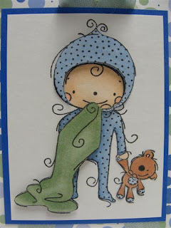
For my project I used Baby Miffie by Rachelle Anne Miller from Sugar Nellie. I made both a girl and boy card.
The pattern for my card came from an idea I saw in Reflections, a card book by Close to my heart. I matted the dp on cardstock and then stiched around the edges.

For the images I colored two sets. My base image is the full image and then the second image I cut out the blanket, hat and teddy bear, added dimension and then put them onto the base image. I colored them using Copic Caio and Sketch markers.


I stamped sentiments relating to boy and girl on each card.


And finally, here is a pic of the inside of the boys card. I inked the edges of the boys card because I wanted a 'messy' look. I think I obtained that!

Saturday, August 15, 2009

Summer Ice Cream - Sugar Nellie

This card was made using five challenges:

Stampavie - summer
Sugar Bowl - sketch and include handmade flowers
Bee Crafty - colored image
Stamptacular - 3 brads, 2 papers and 1 flower
ABC - anything goes

Here is the sketch:

For my image I used Summer Ice Cream from Sugar Nellie Stamps. She is layered two times and a third layer is the hat and ice cream. The puppy is layered twice. I colored the image using my Copic Caio markers.
Here is the finished card. I made my own flowers by just starting with paper and cutting it in a circle. Never tried doing it this way, just let my scissors flow and really like how they turned out. They are not 'perfect' and the petals are all different sizes and not symmetrical. I think it added some flair to the card. Two of the flowers have brads in the center and there is one brad in the upper corner of the mat. I cut the mat using Nestabilities.

And finally .... the inside.

Sunday, August 9, 2009

Tilda Loves You

This card was made for the Magnolia-licious Highlites challenge. Here is the sketch created by Becca Feeken.

There are two giveaways for this - one random winner and one thinking outside of the box winner. Not sure if I met the latter but used Hearts instead of circles. Here is a close up of Tilda. I colored her using the following Copic Caio markers: E000, 00, 11, 21, 31, 33, 35, 57, R27, 17, YG03, 23, RV23, 13 and BV13. I added some white highlites with a Sharpie.

The ribbon is wired floral ribbon and I just love having the ability to shape it. The bow is accented with a little glitter flower in the center. The paper is from my stash that I have had for awhile and I don't remember where I purchased it or who made it (I'm bad about that!!).

The inside of the card has a large heart with another little glitter flower. The journal area has green leafs and one more little glitter flower.

Disclosure Policy

This policy is valid from February 26, 2011

This blog is a personal blog written and edited by me. For questions about this blog, please contact hester.stephanie@gmail.com.

This blog does not accept any form of cash advertising, sponsorship, or paid topic insertions. However, we will and do accept and keep free products, services, travel, event tickets, and other forms of compensation from companies and organizations.

This blog abides by word of mouth marketing standards. We believe in honesty of relationship, opinion and identity. The compensation received may influence the advertising content, topics or posts made in this blog. That content, advertising space or post will be clearly identified as paid or sponsored content.

The owner(s) of this blog is sometimes compensated to provide opinion on products, services, websites and various other topics. Even though the owner(s) of this blog receives compensation for our posts or advertisements, we always give our honest opinions, findings, beliefs, or experiences on those topics or products. The views and opinions expressed on this blog are purely the bloggers' own. Any product claim, statistic, quote or other representation about a product or service should be verified with the manufacturer, provider or party in question.

The owner(s) of this blog would like to disclose the following existing relationships. These are companies, organizations or individuals that may have a significant impact on the content of this blog.

Currently designing for:

Stamping Scrapping

Companies that have provided me with free product or images:
Stamping Scrapping
anaRy Designs
Spellbinders
Basic Grey
Scor-Pal

Digital Delights

La La Land Stamps

JustRite Stamps

Woodware Stamps

To get your own policy, go to http://www.disclosurepolicy.org

LinkWithin

Blog Widget by LinkWithin